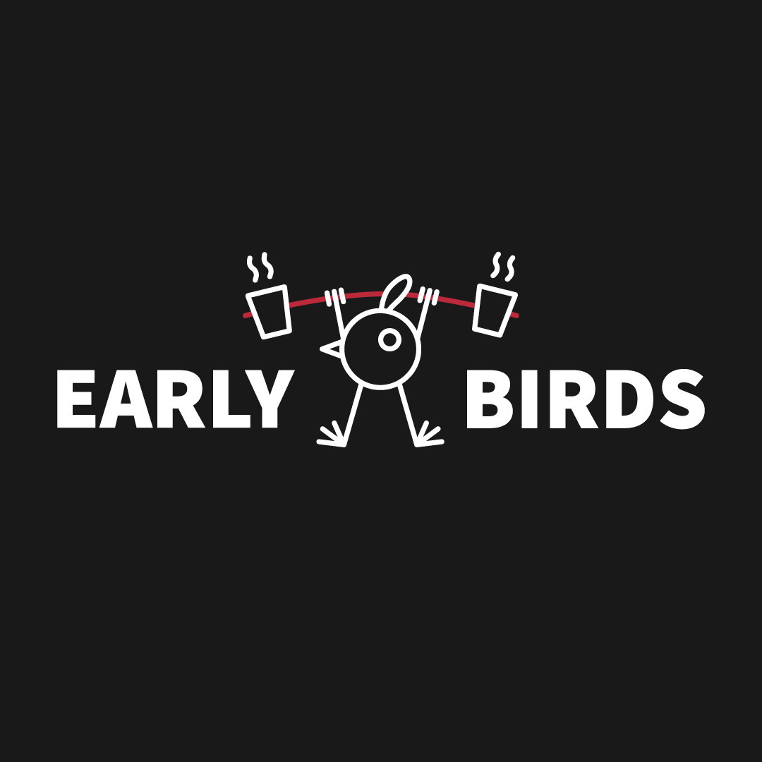
Local crossfit enthusiasts wanted a logo based on their name: Early Birds.
I designed the logo, and setup a spreadshop for them to buy what apparell they wanted.
Originally they wanted a more cartoony look. This was the design most of them liked.
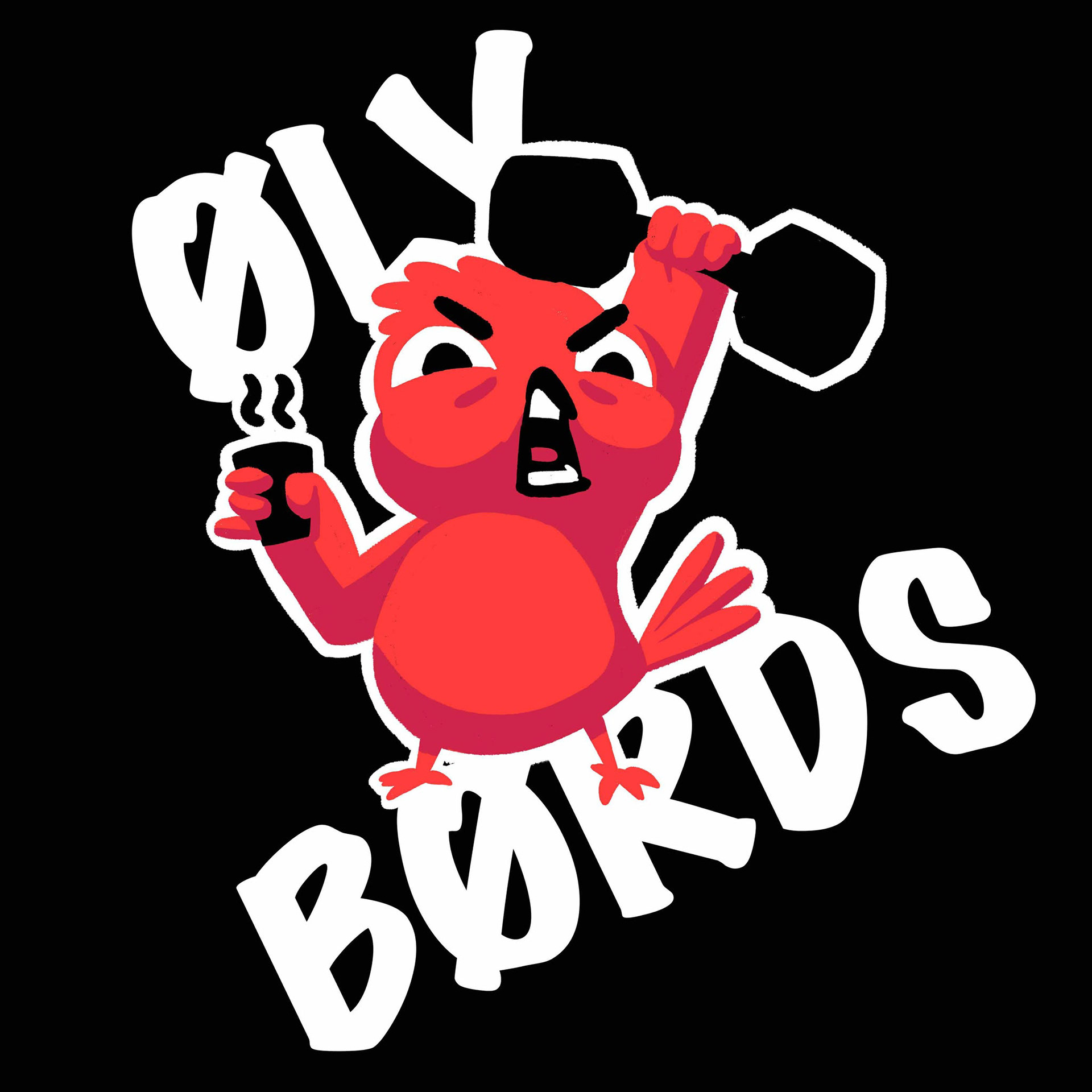
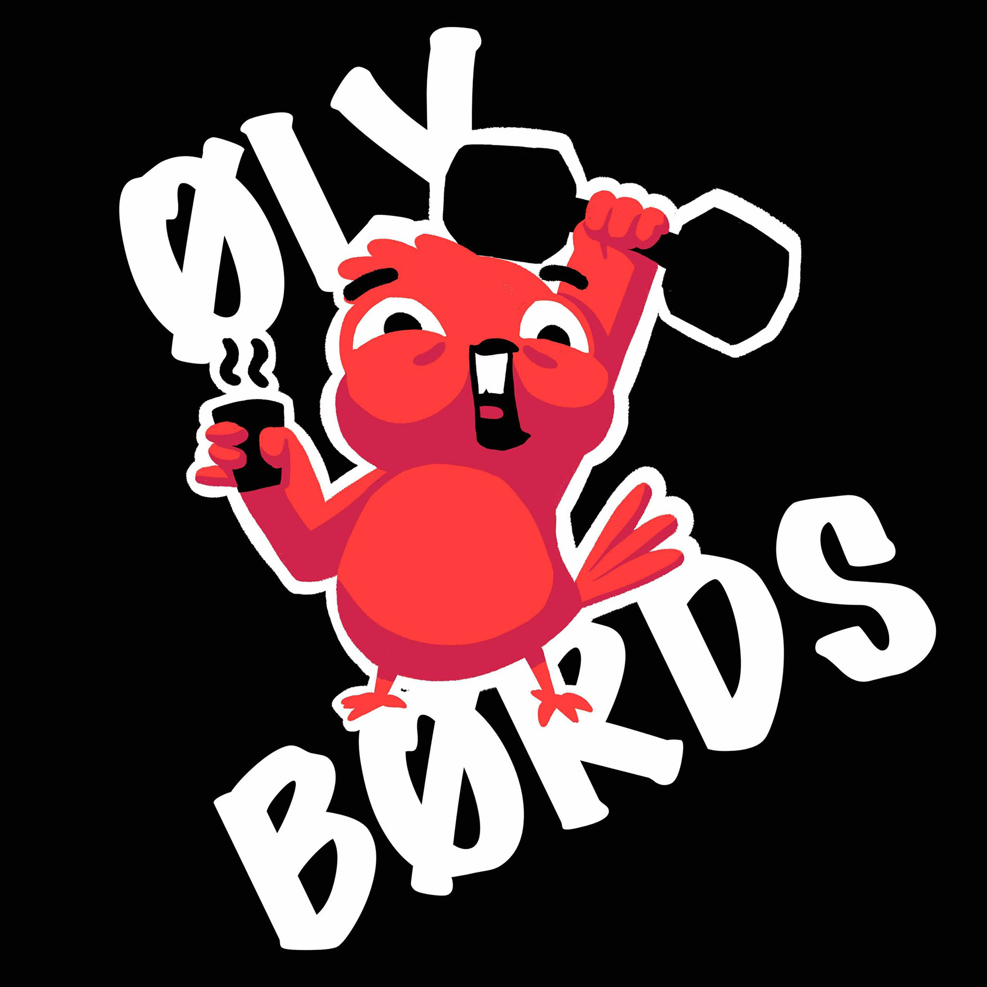
But the group was still divided. When I suggested a more graphic approach they all approved. Below are some sketches for the new direction.
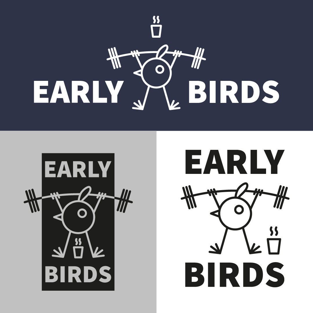
And the final logo ended up being a wide format catering to what the group liked.